Brand kit
Gangly, as it should look.
Logo, colour, type and the UI tokens that hold the product and marketing surfaces together. Source of truth lives in app/globals.css and components/marketing/Logo.tsx — this page is the working reference.
Mark
Three pieces packed into a square.
The mark is the product: unequal rectangles nested with no slack. It has to read at 20px in the header — that is the only size that matters day to day.
Lockup
Wordmark is system sans at 15px / semibold / tracking −0.01em in ink. Gap between mark and name is 8px. Do not outline or reverse the nested pieces.
Colour
One accent. Surfaces that stay out of the way.
Tokens swap with the theme class on :root. Values below are the dark defaults; light overrides live under :root.light. Click a swatch to copy the hex.
Accent
#2b8fff
Primary action and brand signal. Light theme uses #1a73e8.
Accent ink
#ffffff
Text and icons on accent fills.
Ink
#e8ebf1
Primary text. Light theme: #10141b.
Ink 2
#b6becd
Secondary body copy. Light theme: #39414f.
Muted
#7b8496
Eyebrows, captions, quiet labels.
Cut
#ff2bd1
Contour / cut-path signal. Light theme: #d6009e.
Surfaces
App
#0a0c10
Page background.
Panel
#111419
Cards, chrome.
Panel 2
#171b22
Inset surfaces, fields.
Elevated
#1e232c
Hover lifts, raised UI.
Line
#262c37
Borders.
Line soft
#1c212a
Section rules, quiet dividers.
Film
#0f1319
Sheet substrate in previews.
Canvas
#10141b
Marketing paper. Light: #f7f6f3.
Status
Danger
#ef4444
Destructive.
Warn
#eab308
Caution.
Ok
#22c55e
Success.
Light theme accent
#1a73e8
Slightly deeper blue so accent type and fills hold contrast on paper-white panels. Same role as #2b8fff in dark.
Halo / bloom
--halo: rgba(43, 143, 255, 0.16)
--halo-2: rgba(255, 43, 209, 0.08)
Soft radial blooms behind heroes — accent plus a cut-path pink whisper. Never a full-page purple gradient.
Type
Tight grotesk. One italic foil.
No webfonts on the marketing or builder surfaces — system stacks only. Shop admin is a separate skin (Inter) and is not part of this kit.
Display
.mkt-display · system sans · clamp 2.75–5.5rem · tracking −0.045em
Serif italic
.mkt-serif · Georgia / Iowan Old Style · italic foil to the grotesk
Section title
SectionHead · 26–32px · tracking −0.02em
Body
15–16px · leading-relaxed · ink-2
Eyebrow
.mkt-eyebrow · 11px · uppercase · tracking 0.16em
Mono / numeric
.numeric + mono stack · measurements and tokens
Editorial recipe
You lay out the film. We print exactly that.
Display grotesk + skewed accent highlighter + Georgia italic. Use sparingly — usually once in a hero, not on every section.
Components
Pills for marketing. Buttons for the product.
Marketing CTAs are full pills; the builder and secondary pages use .btn variants. Both pull from the same accent and ink tokens.
Marketing pills
.mkt-pill-solid · .mkt-pill-accent · .mkt-pill-quiet
Chips & links
.mkt-grid + .mkt-halo
Blueprint grid and ruler ticks borrow the artboard’s furniture for marketing sections.
Voice
Name it once. Say what the press cares about.
- Product name
- Gangly. Always capital G. Never Gangline (legacy), never “the Gangly app” in headlines.
- Tagline
- Simplify your print workflow.
- What we sell
- A production gang-sheet builder customers use themselves — not a mock-up of one.
- Tone
- Plain, precise, slightly dry. Prefer inches and DPI over hype. British English in product copy where it matters (colour, organisation).
Guardrails
Keep the surface recognisable.
Do
- Use the mark at 20–24px in chrome; keep the rounded square.
- Pair the mark with the wordmark in headers and footers.
- Let accent carry CTAs and the highlighter mark (.mkt-marker).
- Keep display headlines tight-tracked and short.
Don’t
- Stretch, recolour, or drop a drop-shadow on the mark.
- Substitute Inter or a purple gradient for the product surface.
- Use the shop-admin green (#008060) as Gangly brand colour.
- Crowd the first viewport with stats, pills, or card grids.
Social
Profile and cover for X & Facebook.
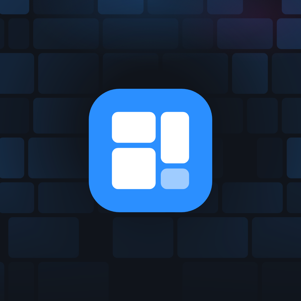
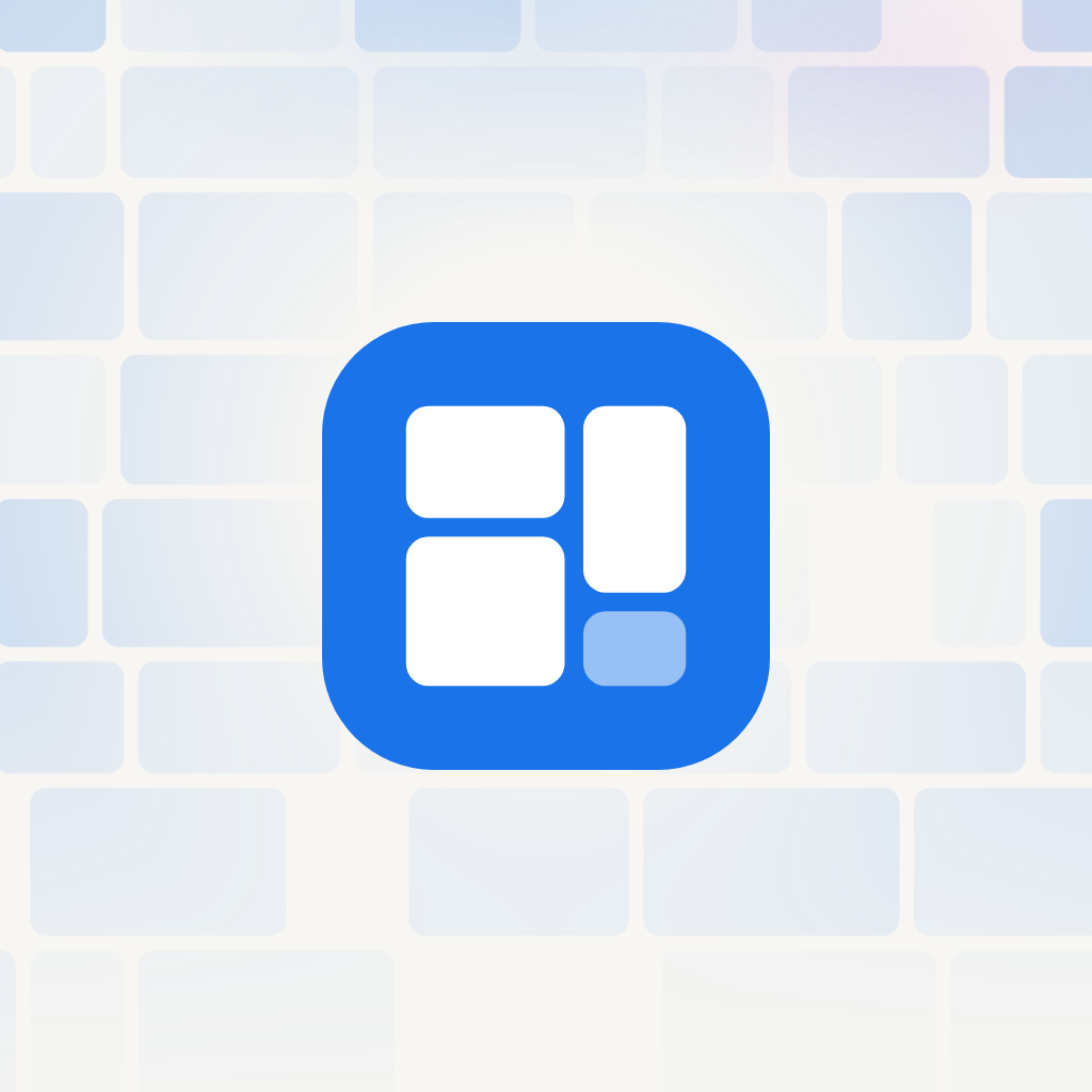
Same mark, composited on the real landing HeroMosaic (accent pack, edge mask, mkt-halo). Light and dark for profile and header. Regenerate with the dev server up: npm run brand:social.
Profile · 1024×1024
Header · 1500×500
Sized for X headers. Facebook covers crop toward the centre — the lockup sits in the safe middle on both.




Where the tokens live
- app/globals.css
- components/marketing/Logo.tsx
- public/brand/gangly-mark.svg
- public/brand/social/